 ¶ I AM A GEOMETRIST BY TRADE, but one who has stumbled onto something so interesting that my focus has been given cause to waver. And though the object I examine may not be geometric, my eyes are still those of a shape-seer. I may be studying history — or rather, futurology — but I tend to approach the subject as if time were a shape.
I see angles.
I see planes.
I see vectors.
And I think it may be because of this that it is all starting to make sense.
How an old and incorrect chart can show us our future
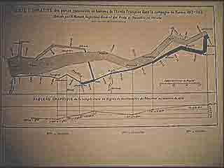
THIS EXERCISE WAS INSPIRED BY AN ERROR, as are most good ideas. The chart above was chronicled famously by Edward Rolf Tufte in his book The Visual Display of Quantitative Information. As you can see, it is a seriously degraded copy. I could, of course, have merely scanned a clean copy from a current edition of his book, as it was published as recently as 2001. However, this degraded copy is in fact at least 1200 years old, and hence a more original source on which to base my findings. I do not mean to say that it was created in the 0800’s — that would be a ridiculous assertion. I mean that it was actually created 1200 years in the future.
It is incredibly difficult to date digital material, but we do have several faculties that can aid us in this endeavour:
Last Modified: This can give us some insight into the age of digital material, but due to the cyclical nature of our time continuae, a modification made at a later date — if made ’round the bendð1 so to speak — can actually give aLast Modifiedas older than it’s original creation. So, as you can see, while some information can be gathered from this property, it does have it drawbacks.- Digital Artifacts: This can of course be faked by exporting images under incredibly low JPEG settings, but we have found that digital images actually naturally degrade over time. Also, natural digital degradation leaves a tell-tale burnishing effect in addition to the typical mottling artifacts, and while this can also be faked, it is not something generally done as a matter of course during the compression process. The level of burnish and degradation of this image tallies with its
Last Modifiedof 2475ð2, meaning that it was last edited over 400 years in the future. - Qualitative Analysis: Simple logic denotes that the only beings that could have created this chart would be those who knew the entire story. That is, beings aware not only of the human revolt from time in 2600, but also of the reentry around 2003. This means that the earliest this image could have been made was 20032 on a horizontal time scale, equating to 3197 ARð3. It had to have been created by the ancestors of beings who had traveled the 1200 years back in time, because they could not otherwise have known of their re-entry into our current time continuum.
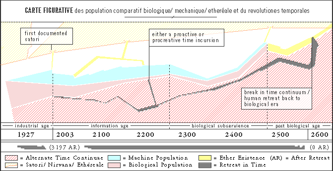
I have labelled the Chart above correctly, based on evidence from various ether core-samples taken during my investigations into The Life of Møebius E. Plink, Ex-Human Coder, in addition to detailed analysis of the correct but mottled image of which we have just spoken. I believe that The Brethren himself is an ancestor of Dr. Plink, or perhaps even a psuedonym for Dr. Plink himself, as The Brethren is heralded as departing from time shortly after Dr. Plink is thought to have been subsumed entirely by the ether. The chart begins at 1927 AD, a date I believe was chosen because it marks the advent of primitive machine intelligence. This period of time is widely known as the Industrial Age, because the machines of this era were of a rote and duty-driven nature, efficiently organized into the assembly-line paradigm that is this age’s lasting legacy even today.
In the late 1990’s we enter the Information Age, when the importance of the physical capabilities of machines were devoured by thier abilities to hold and process data. This age — in which we currently reside, shows the human population [pink] as slowly falling in relation to the computerised counterparts [blue]. We can follow this trend to approximately 2270, at which point it seems humanity has relinquished most of its workload to the machine.
It is at this date that we enter what the original chartist referred to as the Age of Biological Subservience. Here we see the previous trend in reverse: humans begin to outnumber machines, until by approximately 2350 there is almost the same degree of inequality in population seen at the end of the Information Age, but in reverse. By analysing these two trends next to the suggestive name of the era, I can only surmise that this was a period in which a vast human population served as serfs of a sort to their mechanical captors.
By approximately 2460 we see the chart enter what is referred to as the Post Biological Age, and we note that both the [pink] for Biological and the [blue] for Mechanical have resolved into a [yellow] labelled quixotically as Ether Existence. This appears to be a world with neither humans nor machines, a purely virtual realm when even time itself ceased to have any tangible properties. It is due to the ethereality of time in the ether that I am able to take my samples from so many different points in the future.
By 2600 we see what is labelled the break in time continuum/ human retreat back to biological era. It seems that after almost 150 years of pure ether-living, some humans <‘missed thier bodies’, and made a break for it. Th continued trajectory of the [yellow] indicates that others contued in their ether existence forward in time. ¶The chart begs as many questions as it answers. We see a human population brought into slavery by machines, and then a union in a unified core. Finally there is a rift, with two factions splitting off: those who wish (or were forced) to continue this etherlife into the future, and those who preferred (or were forced) to turn back in time towards the biological age in which we now exist. I cannot possibly hope to understand the reasons or the how for any of this. My
WE samples from the ether, while growing increasingly intelligible as these beings learn to communicate in our fashion, are nevertheless opaque and contradictory. And any knowlege reaped from the THEY samples are suspect, as I have already noted several cases of purposeful deceit, including suspicions that part of even this chart was faked by THEM in the Last Modified of 2475ð2.
I will leave such questions as intent and such descriptions as societal to the Anthropologists. As a geometrist, I see two major avenues of investigation open for elucidation.
After leaving the ether-life, it appears the time-revolutionaries re-entered our continuum at about 2240 AD (2960 AR). We then note that the width (denoting population) increasing, so it can be safely assumed that this was not a flight but recruitment effort. The trip back must have been dangerous, because we see an ever-dwindling population, whose sole kick-start was this visit. I cannot begin to guess what the purposes of this incursion were, but the end result was an increase in population. The fact that they returned to their alternate continuum to head back to an earlier era suggests that our time continuum was not acceptable at that time. Perhaps, so close to the era of Biological Subservience, the situation was already dire for the humans.
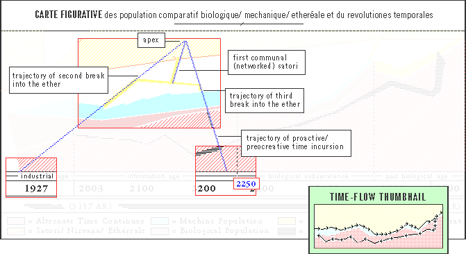
What the trajectories of incursion tell us about Satori
¶But what I find interesting is the trajectories this visit, and the final re-entry, trace along with the various satori. Not only does the 2003 incursion lay as a point on the same slope as the second break into the ether, but traced all the way down to the flat plane of time, we find that 1927 does as well. That is, the birth of primitive machine ‘intelligence’ lies on the same trajectory as the re-entry into our time-continuum and the second break into the ether.Moreover, the first revisit to our time continuum, the trajectory of proactive/ procreative time incusrion, lines up with the trajectory of the third break into the ether. The second and third ether-breaks then turn abruptly towards each other and rejoin at a centre pint, then tracing a path into satori that meets at the very same apex their original trajectories would have reached. The question this begs is: Why would these two regroup if they were all to end up at the same place together anyway? The answer could be something as simple as the desire for comradery. Or perhaps there is an inertia that must be overcome when acheiving satori that they could only achieve en masse.
In any case, while the first documented satori was an isolated event directly perpendicular to flat time from the point at which they re-entered our continuum, the second and third were re-routed to be communal. The fact that the first documented satori was acheived with approximately half the mass as the second and third suggests that — if you will allow — Heaven has a memeory. That is, each progressive attempt at satori requires a greater effort. Just look at the mass of the final slope, the yellow stroke entering the ether just after the human revolution from time. Enormous! Of course, as this last one is not labelled as a satori, and as the Chart does not show any gap in the orange line separating satori from the ether — as is the case with the labelled satoris — it is my belief that this last vector did not enter nirvana.
Perhaps it is suspicion of this impending failure that lead to the human revolt. Because, remember, although we do not know at which turn ’round the bend the different satoris were achieved, the corresponding trajectories suggest that these breaks did not occur until after the revolution and subsequent incursions. All of which outlines a reason for the revolution: perhaps they wanted to achieve satori, and sensing that their combined effort was going to fail, went back to try again.
There had to be some reason for undertaking a 1200 year journey that so dehabilitated thier population.
What the slopes of time tell us about TimeTravel
¶An analysis of the slopes and depth of the backwards time trajectoies leads me to believe that Time Travel — contrary to warp speed science fiction — takes time. Notice that for the most part, the retreat in time hugs the continuum from which they had come as closely as possible. Like a ship hugs a shore. Also notice the continued decline in population as they went back. Together these suggest that traveling back in time took an incredible amount of time. They were weary of straying too far, and they took enough time in thier travels for their livelihood to wither and stabilise.Furthermore, we do not see the sharp angles we would expect if the L’Engle Thoery of Wrinkles in Time were true. According to her theory, one can bend time like a string, and by matching two points far away in time at the wrinkle, one can leap huge distances of time in a moment. The fact that no continuum ever meets itself in this way gives further credence to my theory that time travel takes at least as long as the time being traveled. It just goes backwards. In other words, it takes 1200 years to travel 1200 years. This is a supremely logical, if ultimately dissapointing scenario, and it is one all of the evidence supports.
Finally, the shore-hugging behaviour of the alternate time continuae seem to suggest that there is a finite amount of time. Horizontally, it seems time can go on forever, but there are very definite boundaries to the height of time. What’s more, with the [red stripes] being alternate the Vertical space for alternate time, we can see that our current (non-alternate) time continuum is running out of time. The red slope of the Chart is ever increasing, while our current continuum becomes sequuezed binto an ever-tightenening gap between Nirvana and Alternate. This may give us an explanation for the entry to ether-existence.
My final observation, for which I have no theory whatsoever, is the tear in Nirvana we can see towards the left of the chart. I have no idea what this means. No trajectories seem to tell us anything about this fact, but the graphic imagery is undeniable: there is a rift in Satori around 1940 AD.
Summary
¶Although this has been a tremendous find, there is clearly much more work to do. For the first time the seemingly random samples I have found in the Ether make some sense, and I feel I have a clearer idea of the schedule of it all. The how and why, as I have said, are still unclear, but I hope that through more Geometrical Analysis, linked to the more abstract anecdotal evidence I uncover from time to time in the ether, I can begin to shed more light on our future. There is a tendency to consider time and ether-study akin to Space: something interesting and newsworthy, but rarely all that practical. However, as we have seen today, this research not only informs us about our own civilisation, it warns us about the future of our own civilisation. And there can be no denying it is a warning.Proper ether-core sampling is a time-consumign and expensive process, and as the immediate benefits of my work are less tangible than those of, say, a software programmer, it can often be hard to find funding for my work. Add to that the radical nature of my studies, the doubt and fear such paradigm-shattering assertions can cause, and you see the precidament I find myself in. If you would like to help out, either financially or through volunteer work, in this vital and fascinatng research, please contact theysaysmall@gmail.com. ¶Thank you.
Endnotes
ð1 ’round the bend: Imagine time as a clock. When the hand comes around to 12, it starts over again. Now, imagine it as a 24 hour clock. It reaches twelve and continues to increment. This is the model I use for counting time that loops back on itself, as is the case in the chart on which this paper is based. When I refer to an occurence as ’round the bend, I mean that it may have taken place the second or third lap around this time loop. This is how the year 2003 AD can be at the same time be 3197 AR, because it is the 2600 Clockwise years + the 597 Counter clockwise years back from 2600, when the time revolution began. It could possibly be — at the same time — 4391, as we don’t know how many loops have occured so far. We also don’t know if time loops can be broken, though the retroactive break to Satori suggest that time flow can be changed the second (or third) time around.
ð2 The
Last Modified of 2475: This > 1200 year old image was Last Modified at 2475, leaving only 473 years back since this last edit. This is the same date that mechanical and bioloigcal existence were subsumed by the ether, which suggest two possibilties:
- The affects of the transformation to ether-existence were so sever and far-ranging that they affected all time continuae. Meaning that even though this image was not edited, it was scarred as if it had been by the destruction of time as a one-way medium.
- Sabotage by
THEM:THEYseem to have taken over at the outset of the period of biological subservience. AndTHEYhave repeatedly tried to hide this fact from us. Although I am convinced this chart was created in 3197 AR,THEYmay have altered it to try to hide some fact from us at a later/earlier point. Consdiering the damning nature of the Chart, this is incredibly improbable, unless the reality is even more chilling than the story the Chart describes.
ð3 AR = After Retreat (2600 AD). Just as we count forwards from AD, we count backwards from the year 2600, when one continuum of time reversed.
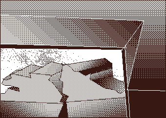
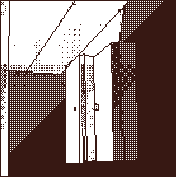
Unrelated Geometries from the Commonwealth {filler}: